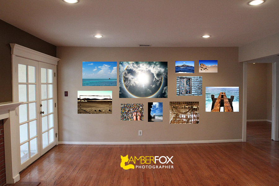
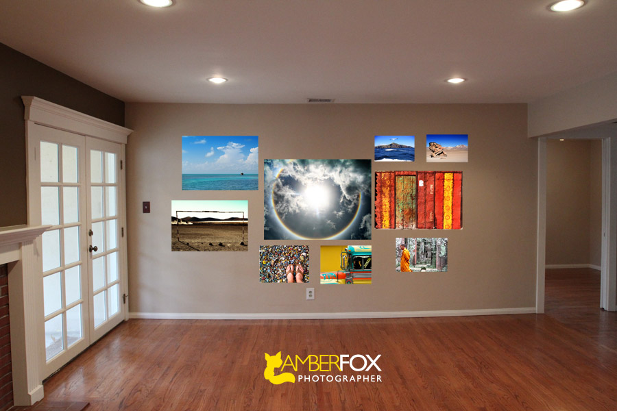
“That which we elect to surround ourselves with becomes the museum of our soul and the archives of our experiences,” said by Thomas Jefferson. I found this quote somewhere on Apartment Therapy one day as I was perusing their fabulous website and it totally motivated me for the theme John and I are doing for our large wall in the living room.
We want our walls to speak of our journeys around the world and tell a story of the many countries we have visited. Traveling is a huge part of our identity, so we wanted it to play a major role in how we decorated our new home.
Our walls are a coffee with milk color, with one wall being a really dark brown. Our furniture includes a dark blue mid-century modern couch, a yellow mid-century bench, a dark brown piano, five big book shelves filled with a 1000 books and a muted yellow rug. Our furniture is bright and happy, reflective of our personalities. The whole wall we envision to be filled with beautiful metallic photos mounted on a really thick surface with aluminum siding.
As I started putting the images together, I found myself perplexed. Even though I help my clients do this with their photos, I am having a really hard time doing it for myself. So that’s where you come in. (Please don’t get too caught up in the sizing of the actual photos and actual arrangement, as this is just an idea board.)
Do you think we should have a common color of blue and brown to tie all the photos together?
 Or do you like a more colorful approach?
Thanks for your input everyone. Since I have become a homeowner, I am incapable of making any decision by myself. Lame! So thanks a million!


I think you should add color!
Crap, I’m no help in this one. I love all the photos, thus want you to use ALL of them somehow on the wall. 🙂 I think if I had to pick, I’d pick the top photo arrangement though. And then somehow work in that rad colorful bus shot. 🙂
I personally like the blue/brown combo 🙂
I like the color approach
I like the top one best. The one with all the orange somehow bothers my eyes…its like it doesn’t mesh with the rest.
You know the best thing? If you don’t like it you can always change it again. Bored? Move the furniture around and change the pictures….LOL
They both have a very different feel. On one hand I really like the calming feeling that the blues and browns have, and on the other the color that the warm tones gives really makes it pop. I think that if you want more of an impact, go with the colorful approach. While both are beautiful I think you’d have more people saying “WOW!” when they walk in your home.
Color! Color! Color!
But I would still put less on the wall and not go so low on the wall.
I like the first arrangement! By the way, your house looks GORGEOUS!
Though the blue theme is more visually unified it’s bound to be taken over by sky and water shots. Careful arrangement will make the color approach work and make it easier to incorporate more images as you continue to travel!